Don’t Say Pull When You Mean Push
Back to BlogImage on Flickr by slimmer_jimmer
The world around us is filled with user experience cues that we take for granted. So much so, in fact, that we don’t even notice they exist until something comes along to violate those norms to a degree that they disrupt what we are trying to do, causing a lot of aggravation in the process.
One of the most common examples of this is a door to a commercial or retail building. There are established cues for how doors are supposed to work: A curved handle or knob signals you to pull, while a flat surface or horizontal bar signals you to push. These cues work well and people can easily use doors without having to ever think about it.
But sometimes, for whatever reason, designers of doors decide to break these norms. Maybe they want symmetry on either side of the door, maybe they want it to look fancy or match a specific aesthetic, maybe they just want to do something different… but for whatever reason, they decide to place a curved handle on BOTH the push and pull sides of the door. This leads to the inevitable: people walk up, attempt to pull a couple times, get confused and frustrated, and finally push. It can be amusing to watch as a bystander, but a very negative experience for the person just trying to get through the door.
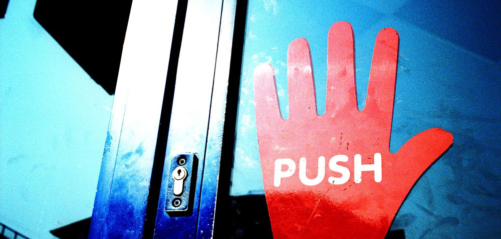
The door designer or business owner tries to make up for it with extra signage (maybe a PUSH label right above the misleading handle) but the damage is already done, and no amount of supplemental instruction is going to alleviate the user frustration being caused by this arbitrary misuse of design cues.
This same principle also applies to the design of a website. There are many user experience norms that people expect when they visit a website: where the navigation is located, how it functions, where certain types of information can be found, how the information is organized, and even how sites behave on small screen vs large screen devices. If you decide to break these norms, especially without a well-researched reason for doing so, you are doing the equivalent of placing a PULL handle on the PUSH side of a door. The difference is that your users do not need to go through your door like they do to exit a building. If they become too frustrated, they will simply leave and go elsewhere.
Have you seen any examples of web interfaces that work like a confusing door? Have any of them been successful?
Leave a Reply