Redesigning the WordPress Template Hierarchy
Back to BlogUPDATE:
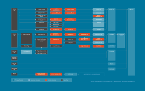
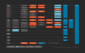
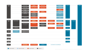
Template Hierarchy graphic has been updated to include all the new and removed templates since version 4.4, including oEmbeds and the new Post/Page Template workflow.
- Blue
- Dark
- Light
And of course, hop on over to wphierarchy.com to see this graphic in action!
As a person with a passion for infographics and simplifying the display of data, I am always looking for ways to make information more clear. The world is filled with an ever-increasing amount of data, but this data is only useful to us if it is usable. A well designed infographic makes even the most complex ideas understandable, but a poorly designed infographic can make simple ideas needlessly confusing. It is this exact usability issue that plagues most infographics today, even within a place I seem to be spending an ever-increasing amount of my time: the WordPress Codex.
One of the most crucial pieces in understanding how to develop WordPress themes is the WordPress Template Hierarchy, the way that WordPress decides how to lay out the content based on what sort of content is being served. The Template Hierarchy, in combination with other cool functionality like Custom Post Types and Custom Taxonomies, is what really enables WordPress to have great granular content management, and create custom visual solutions for increasingly specific types of content. (for the non-geeks reading this: just trust me, it’s neat!) However, while the information compiled on the Template Hierarchy is great, the visualization of it can hinder its use due to its inability to be quickly scanned and understood. So, I decided to take it on as a personal project!
This isn’t the first time the Template Hierarchy has been revisited. The great folks at WordCamp Minneapolis put together a whimsical Template Hierarchy poster for their attendees (I have one!) that makes a great addition to any WordPress professional’s bulletin board, but the design focuses more on fun than functionality, targeting an audience that already has a deeper understanding of how it works.
My priorities in redesigning the WordPress Template Hierarchy to make it more useful as a quick visual reference were:
- Better quick scan left-to-right readability
- Ease distinguishing primary templates, secondary templates, and templates with a variable from the content types
- Cohesion with the WordPress brand, including colors and aesthetics
Let me know what you think! Feel free to use it, pass it on, and leave some feedback!
31 Responses to “Redesigning the WordPress Template Hierarchy”
-
Dusty Awesome work Michelle! Love how you made it easier to understand. It’s always been a great tool in the WordPress codex, but obviously could use the work to make it more usable.
-
Dan Great post! Very useful. Is there a way to add a link to download a higher resolution version for reference? The type is really small.
-
Marktime Media Hi Dan – You can right-click to get the full-sized image, but I’ll probably be putting together a PDF version also (when I have some time) that I’ll link to as well!
-
-
Scott Offord -
Aaron Holbrook So awesome to see someone taking a fresh, aesthetic approach to something that’s so very important (and still very confusing to many people)!
Great job Michelle! Hope to see this on the codex soon! 🙂
-
Jean-Francois Arseneault Wow, finally something I can print and give to my team that actually looks GREAT! Nice job!
-
Serverpress Awesome stuff Michelle! But then, what else would we expect?
-
wycks Just a heads up , the infographic is not as accurate as the codex one because yours does not show the actual load order.
The 404 page is first, then search, then tax, …etc, etc.
You can see the load order here: http://core.trac.wordpress.org/browser/tags/3.5.1/wp-includes/template-loader.php#L0
-
Marktime Media I always wondered why it was laid out that way. Interesting!
-
Mathew Porter Nice find 😉
-
-
David Thank you for doing this! Hopefully once all the bugs has been worked out it will replace the one in the Codex 🙂
-
The Weekly WordPress News, Tutorials & Resources Roundup No.31 - WPLift […] Redesigning the WordPress Template Hierarchy – As a person with a passion for infographics and simplifying the display of data, I am always looking for ways to make information more clear. […]
-
WordPress 模板层次结构信息图 | 飞飞默客 […] 我们知道 WordPress 主题有很多文件,比如:index.php,single.php,archive.php 等,WordPress 会根据不同类型的内容决定使用模板文件,这个就是 WordPress Template Hierarchy(WordPress 模板层次结构),如果结合 WordPress 的高级功能,比如 WordPress 自定义日志类型,自定义分类模式等,这个模板层次结构会非常复杂。虽然 WordPress 官方整理了模板层次结果图,但是还是显得非常复杂,所以 Marktime Media 重新设计了 WordPress 模板层次结构信息图(点击打开大图): […]
-
June 2, 2013: Weekly Roundup of Web Design and Development Resources […] Redesigning the Template Hierarchy: Thanks to my friend Michelle Schulp at Marktime Media for creating this infographic to better understand the WordPress template hierarchy. Well done, Michelle! […]
-
Rami Abraham Hi Michelle, I like this a lot, and made an html/css version of it here (with some light embellishments): http://wphierarchy.com
-
Marktime Media Wow, how cool is that?? Don’t suppose you’re coming out to WordCamp Chicago are you? 🙂
-
-
Faison Zutavern I figured this would be in the WordPress codex by now, but I was surprised to still see the old clunky one. Thanks for the great redesign though!
-
Gloria Antonelli You rock! I am using your infographic in my slide show Creating Great User Documentation for WordCamp Chicago. It is an excellent example of making info more clear.
-
draco678 Hi Michelle,
This is a great diagram! Love it because it takes less time to understand the concept with this diagram as compared to the codex version. But, the title “Redesigning the template hierarchy” is misleading as the template hierarchy remains unchanged. (Refer: http://stackoverflow.com/questions/12196986/changing-wordpress-template-hierarchy). Something similar to “WP Template hierarchy illustrated in a readable format” would have been more precise! -
WordPress 模板层次结构信息图 - 代码如诗 […] WordPress 主题有很多文件,比如:index.php,single.php,archive.php 等,WordPress 会根据不同类型的内容决定使用模板文件,这个就是 WordPress Template Hierarchy(WordPress 模板层次结构),如果结合 WordPress 的高级功能,比如 WordPress 自定义日志类型,自定义分类模式等,这个模板层次结构会非常复杂。虽然 WordPress 官方整理了模板层次结果图,但是还是显得非常复杂,所以 Marktime Media 重新设计了 WordPress 模板层次结构信息图(点击打开大图): […]
-
Understanding the WordPress Template Hierarchy - Press Up […] Marktime Media’s Graphical Version: These are a bit large and unwieldy for many contexts, but they’re really thorough and rather nice-looking to boot. If you’re a real WordPress nerd you could even use them as your desktop background. […]
-
设计之家 | WordPress主题文件的结构信息图 […] 查看大图 […]
-
Ladies Learning Code Workshop | Kory Mathewson […] which template file, or php file is used when the user visits a certain page. Learn more about the Template Hierarchy on this sweet data visualization by Michelle Schulp. This infographic will help us determine which file to edit when we want to […]
-
RedEly Really cool tool. Thanks Michelle!
-
Owen OMG, thanks a lot for this. I was creating pretty good static html sites but was having the roughest time trying to translate it over to wordpress. This post definitely saved me a lot of headaches. Almost 1 week of searching, thanks a lot for this post.
-
WordPress: gerarchia dei template files | Epysoft […] Immagine originale su Marktimemedia […]
-
WordPress Harrisburg Meetup: An Introduction to the WordPress Template Hierarchy |Rami Abraham […] Oh! And if you’re looking for print-quality or desktop background images of the template hierarchy, make sure to check out Michelle Schulp’s work here. […]
-
WordCamp Miami 2014: a Touchy-Feely Retrospective |Rami Abraham […] weekend were with Michelle, hands down. I was introduced to Michelle last year when she created her template hierarchy design. We’ve conversed in Cyberspace since then and have seen each other at conferences as well, […]
-
WordPress Template Hierarchy, How WP Selects Template File […] credits marktimemedia.com | View full Template […]


Leave a Reply