Your Website Is Smarter Than Your Presentation
Back to BlogA couple weeks ago, I had the pleasure of attending a masterclass by Edward Tufte, a person I have long respected for his absolute mastery of the display of information and data. Being able to spend an entire day listening to someone whose books I have read is always an extremely enlightening experience, and this was no exception.
What I found most interesting about the course were the constant comparisons being made between presentations and websites, and the implications each style of information delivery has for the viewer. As a person who is in the business of creating both, I was intrigued, as I hadn’t considered pairing the two against each other before. And the more I thought about it, the more valid these points became.
I have always preferred reading the news to watching it, especially online. I never read the news linearly- I would often start with a story, read through it, find some interesting related content, explore that, read a study, look up some additional context from an alternate source… in contrast to televised news, where I never know what’s coming next, am bored half the time by uninteresting features, and always feel like I am missing a huge part of the story because they had to condense it to fit it into the time allotted.
Flat is Smart
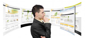
Your website, if designed well, is a “flat” display of data and information, adjacent in space and able to be explored and parsed by the viewer under their own power. And despite the “common knowledge” that people refuse to consume information that is greater than 140 characters, or isn’t cropped artistically with a photo filter, the truth is that we are master analysts of data. Look at the sites millions of people frequent on a regular basis: sports statistics, weather reports, complex maps, endless search results. When data is open to self-exploration, we are amazing at scanning for the parts that are the most interesting or relevant. A smart website doesn’t hold back- the landing page may be attractive and contain minimal text, but more information is just one (intuitive and easily accessible) click away, to pages that contain lots of rich text, links, sidebars, images, videos, and other ways to direct viewers to explore related content.
The Waiting Game
Conversely, your presentation is data “stacked” in time, shoved into an artificial linear format and controlled tightly by the presenter, and often oversimplified or manipulated to the point of being meaningless. You have stripped your audience of their power to absorb information by telling them what they should be thinking and when they should be thinking it. And in between the relevant pieces, your audience is simply waiting for what comes next.
That’s not to say that presentations, talks, or videos don’t have their place. People respond extremely favorably to impactful presentations: just look at the popularity of TED talks, or attendance at conferences, seminars, and WordCamps as proof of that. Just remember that their educational value is second to other elements: the ability to entertain, or to inspire, or to participate in the conversation via Q&A sessions or social comments.
How can you make your presentation as smart as your website?
If you do need to educate people, such as at a meeting or lecture, put together reading materials for everyone to look over when they arrive, and encourage people to refer to it throughout. Your presentation can then be a way to provide context to your data, or to answer questions. Giving your audience the ability to digest important information to them at their own pace ensures everyone will be better off.
2 Responses to “Your Website Is Smarter Than Your Presentation”
-
Kiko Doran Interesting piece. I forget there are people that like to read things. I struggled my whole life with reading. Once I found other types of learning, I just saw it as evolution versus an option, I guess it was progress for me. I don’t consider you “readers” enough. Presentations with pamphlets are really a great idea. Seems like the best conferences I have been to have that. Tony Robbins gives you a booklet with information as well as having areas you need to write to really make things hit home.
Is this something we can change at WordCamps? We would need to change the way we take speaker submissions. Sounds like a super idea though. Also would give the speakers great leave behind information so they could engage with the audience later online. Would it degrade the quality of presentations? Seems it might also make the barrier to entry too high. Maybe we could encourage it somehow by providing a booklet and giving each speaker a certain amount of real estate?
Anyways, loved the piece!-
Marktime Media It doesn’t have to be reading with words, just any sort of rich content- interactive, data tables, charts, code, whatever is relevant! The point is that it is something the viewer can explore on their own, rather than being directed.
In terms of a WordCamp application, I think we don’t have to be literal with our “leave behinds” as something that is printed. Why not a page on a site, or something interactive? Speakers can share the link before/during their presentations. We usually share the “learn more” elements at the end, but we could always start sharing them at the beginning, especially if we’ve put together extra content that can supplement our presentation.
I think that Otto’s Presentation Theme or something similar might be a good start to addressing this at WordCamp talks, because it can contain a lot of dynamic content for the viewer.
-

Leave a Reply